
In this instalment of ‘Process’ you get three illustrations for the price of one. One painted in acrylics, one hand drawn with digital colouring and one entirely digital illustration. I don’t like drawing digitally but sometimes it is unavoidable. Unavoidable because it is just too fucking easy. Sorry, I mean, it is quick and accessible.
To anyone out there who primarily works digitally, I do not dislike digital art. Some of my favourite illustrators work exclusively digitally. But there is just something about it that bugs me, for reasons I shall explain below.
AI Artist
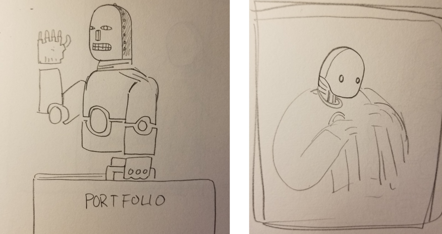
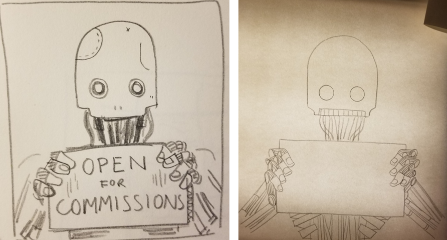
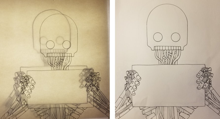
‘AI artist’ is an illustration for Erik Hoel’s essay, ‘Excuse me, but the industries AI is disrupting are not lucrative’. The first idea that struck me was that of an AI bot struggling to find work. The starving artist trope sprung to mind. Tropes can be obtuse but they are also an efficient way to convey a concept. As an illustrator, I am always looking for visual cues. I have a limited space to tell a story and visual cues are the quickest way to tell the viewer what the illustration is about. This image has several tropes built in; the portfolio, the suggestion of fingerless gloves, hollow eyes and a robot. Job done.

Getting the idea from my head to a piece of paper
There are many ways to get an idea from your head onto a piece of paper. Assuming you have an idea, it is fairly simple; draw lots of sketches in a sketchbook or scraps of paper until something looks good. This is how you discover whether the idea works as an image or not. I usually like to draw a rectangle in roughly the ratio of the finished piece and draw a thumbnail style rough sketch inside. This gets the composition sorted fast. Fast loose sketches works the best for me. I try not to think about anything. I try not to care whether the thing looks good or not. The minute I start to worry about how it looks is the point at which the creative process stalls. Which is not necessarily a bad thing. It might mean that I have done enough, or that the idea was shit and should be abandoned immediately. For this one, I bounced between many opposing emotions for the entire process.
It went like this…
First thumbnail - Maybe. Second thumbnail - mmm shit!
Third thumbnail - It could work. Pencil drawing (unusually neat) - Nailed it. WHOO
Ink trace the pencil drawing on the lightbox - ok. It’s good, it will work but it’s total shit derivative crap, no it’s good, light hearted, hits the point accurately, but just lazy, sloppy illustration, archetypes and clichés, no, actually I like it . . . blah blah blah on and on until I finished it.
Not much to do after that. Colouring digitally is extremely easy. Sure there are some specific techniques that aren’t immediately obvious to ensure clean lines and flat colours, but that is for a different forum I think. Starting with clean ink lines makes everything else much easier.
The main trouble with digital colouring is choosing the colours. There are soooooooo many to choose from. This is why I have limited my pallet to just a few colours. You might have noticed this. Well now you know, it is to inject a form of limitation into the process. That’s a problem with digital work, there is no limit. I like limits. I enjoy the creative challenge that limits impose. Creativity is born out of limitations. When the budget for ‘The Fountain’ was cut in half, Darren Aronofsky told his visual effects team ‘no CGI’. The limitations in budget and the constraints imposed by the director led the team to create some of the most luxurious and immersive cosmic sequences ever put to film. And they still stand up today. You should read more about that. It’s pretty cool. They used macro-photography of deep sea microorganisms to create truly cosmic effects.
TV head
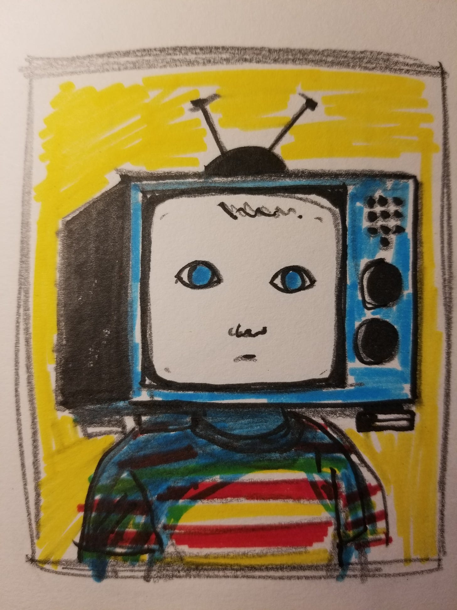
This illustration was created for Erik’s essay, ‘Screen time for toddlers’. It was created entirely using acrylic paints and inks. There are some digital tweaks in there but mostly to cover parts where the scanner had dirt on it and to flatten the texture a little bit so that it sits well on the screen. The black areas are actually full of texture which I don’t think looks great as an illustration designed for screens. So I flattened the black areas. If you are looking at this on desktop I have set this one at full width, so you should be able to see the textures from the paper and paint coming through. Also, mistakes, I like mistakes. Full disclosure, there are two or three digital lines in there.
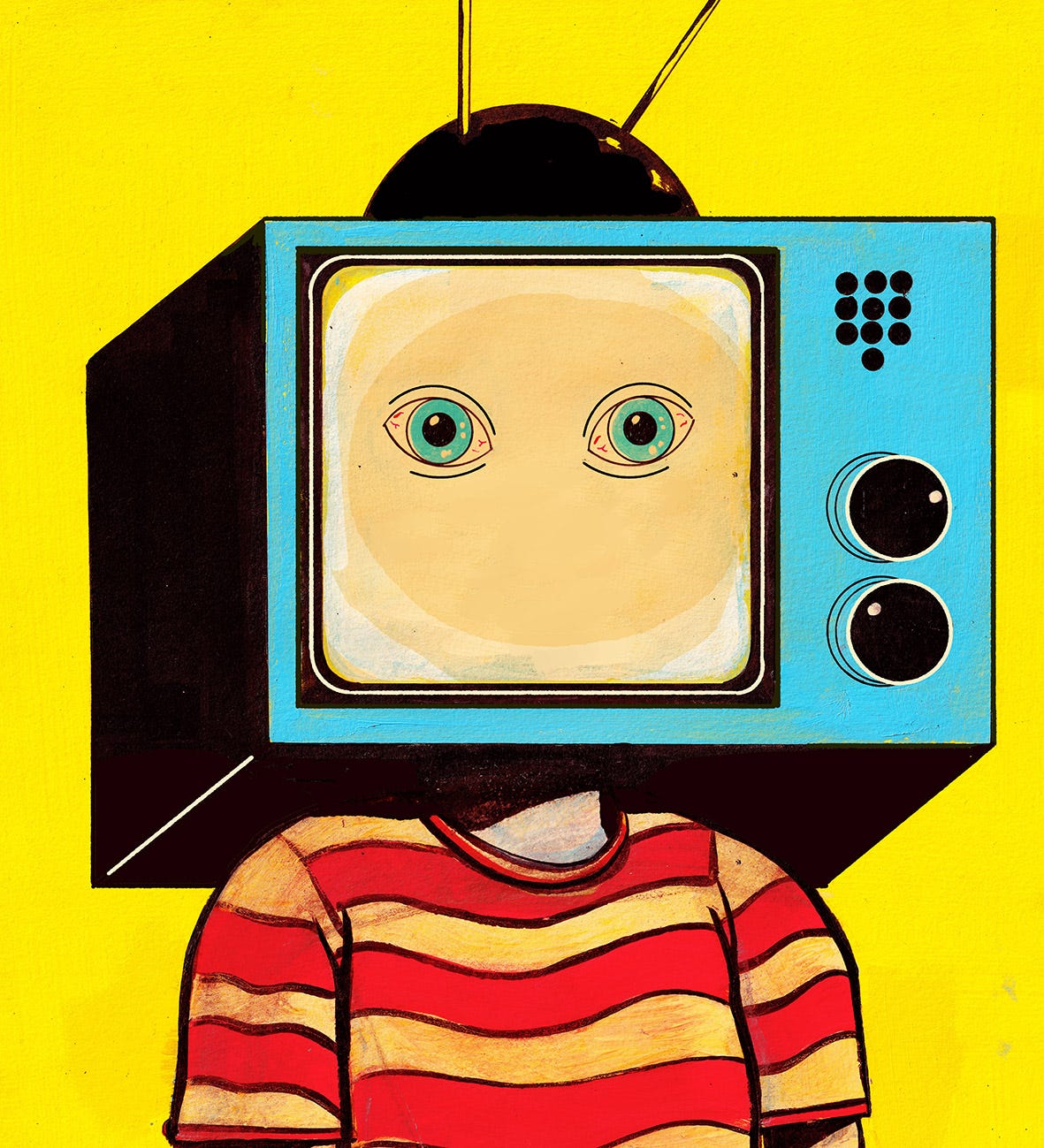
I have a visual library in my mind, formed from all the artwork I stared at for hours when I was a child up to and including any image have seen in the past few hours; which is one good reason to look away when I see bad art, whatever that is. I am acutely aware that many people might consider my art to be ‘bad’ but I honestly don’t mind. It’s mostly a matter of opinion and trends. Never the less, if I see something I think is bad, I have to look away. I don’t want it infecting my mind’s visual library. I recently pulled out a bunch of old art books including children’s books I grew up with and art that I liked when I was a teenager. My mum brought a box over. In it I saw a striking resemblance to my current style and thematic choices. One notable book is a collection of Polish film and theatre posters from the early nineties. I will write more about this in another post because a lot of my ideas seem to have come from this book. This TV head idea is plucked straight out of the Polish poster scene.
The process for this is somewhat similar to the previous illustration up until the final execution of the image. It roughly goes; idea, thumbnail sketches, final rough sketch, light box, trace onto heavy paper (250g/m2 minimum for anyone who is interested in that kind of thing). That’s where the two techniques depart. Next, paint a yellow background, paint in all the solid colours and finish with black ink. I scratched it up a bit too to get some texture.
One small difference is the thumbnail. I had to colour the final thumbnail to check if the colours would work. I don’t have to do that with digital colouring because it is so easy. Sorry, efficient. Digital colouring can be changed in an instant. Acrylic paints, not so much.
Once I know that the colours work, the process of putting acrylic down on paper is very simple and enjoyable. It is vital that you follow a process. If you don’t wait for each layer to dry, the paint will smudge. If you don’t use heavy paper, the paper will curl. If you don’t … blah blah blah. You need to research how to use acrylics and practice with them a bit, but it is essentially quite easy to do an image like this if you plan it properly. The limitation is, it takes time. If you happen to get the image spot on first time, it’s a win. But if you fuck up at any point and have to start again, well, it costs. This is where digital colouring is so attractive. If I mess up, I just press ctrl z. Can’t do that with a painting.
What you don’t get from a digital drawing is this; the familiar smell of paint, the physical evidence on your hands, the jangle of water jugs as you clean the brush, the time away from a screen and a physical piece of artwork I can put on my wall immediately. Proof that an AI didn’t do it.
There it is squished between two other pieces on the right. I don’t have a frame for it yet but there you are, that’s what my studio looks like as I write this. There’s a little preview of the next part of this essay on the monitor there.
New York Subway
This third illustration was created for Erik’s essay, ‘Serial killers are out. Subway pushers and mass shooters are in’. It is a rare case for me, in that it is entirely digital. I don’t think it hides this fact. The lines are unnaturally clean and the colours are completely flat. I like the image. I think it works well for the source material. But the process behind it was less enjoyable than the other two illustrations above. Not unenjoyable per-se but just not as fulfilling as the other two. It was quick. And therefore economic. As a commercial artist, I have to think about these things. First and foremost is the illustration; the artwork has to work. It has to draw the reader in and convey concepts etc. But it also has to be economically viable for me. This one just happened to work as an entirely digital image. I skipped the steps in the previous two illustrations, almost by accident. Sometimes, while trying to come up with a concept, I will sketch something digitally. I usually do this if the idea in my head involves a lot of black. Indian ink is expensive, so, for the purpose of checking whether a black background will work as an effect, it is a lot cheaper to drop digital ink.
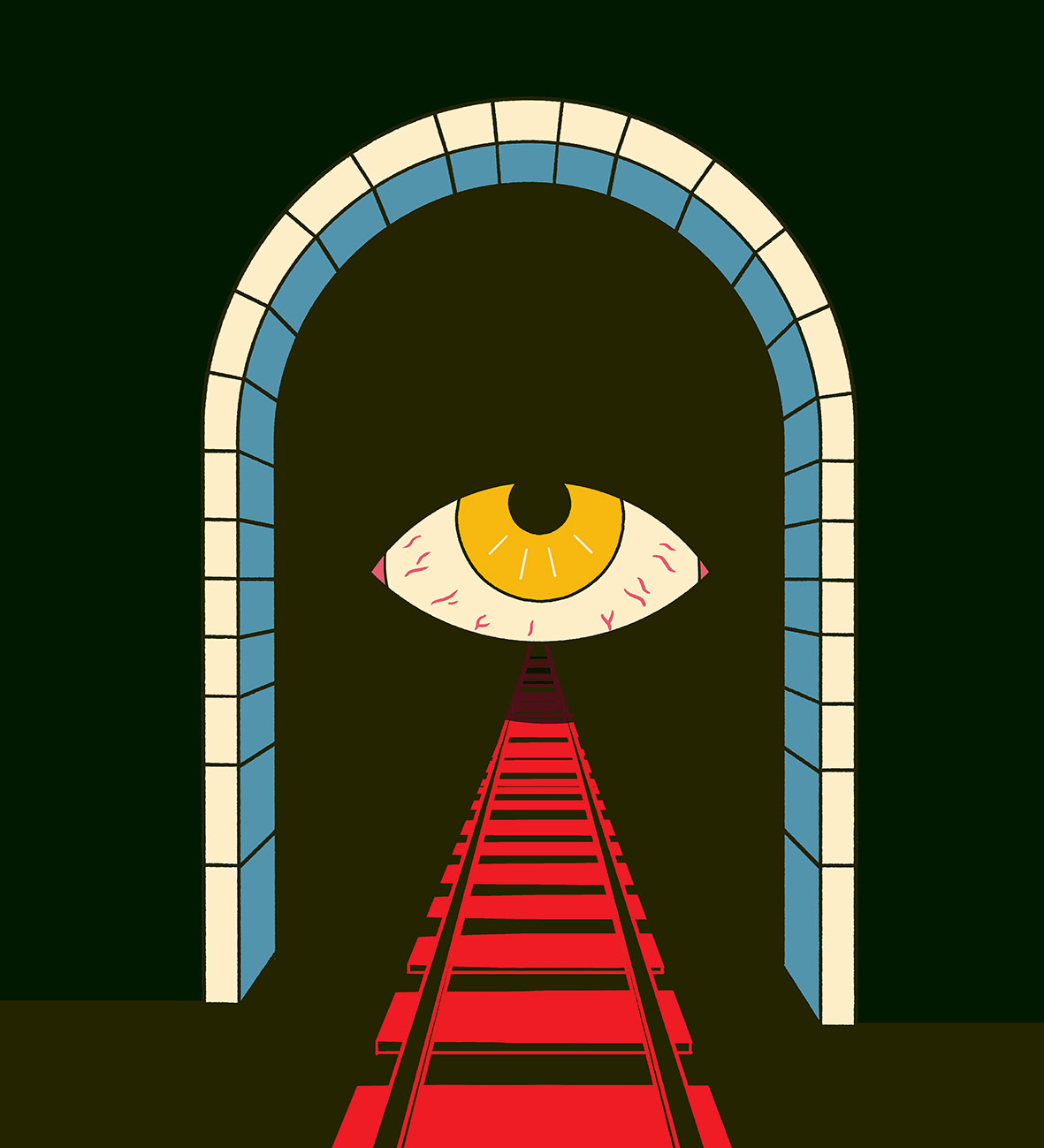
As I was sketching this out on photoshop, I had the intention to redraw it by hand to get a more hand-drawn look, but the further I got, the more I liked the stark finish. I also had the feeling that if I drew it out by hand, it would end up looking the same. So why do it by hand?
What’s the difference?
Well, there isn’t one really. Not the way I do things anyway. Take a look at these three illustrations side by side. The style and finish is somewhat similar. I suppose there is a little bit of texture on the TV head, but the difference is not drastic to my eye. For me, the difference is not the point. The final image is not the only goal for me.
For me, the point of abandoning a regular salary to become an illustrator is to enjoy the process. I can’t afford other luxuries, so my main luxury has to be my job. The books are balanced this way. I don’t like fancy cars or golf or expensive holidays. I do not care that my house is small. My priority is to my family and my time.
I like drawing. I have always liked drawing. In periods of my life when I didn’t draw, I missed it. There was a hollowness about my identity which I did not fully realise until I started drawing again. And when I took seriously the idea that I should be making art instead of a salary, I walked out of a funk that I had been unaware of and into a much brighter world. A weight was lifted. The fog in my life was gone. When I realised I could be poor and happy making esoteric comic strips and creating art, I was elated. I understood the reality of being poor would catch up with me eventually, especially on rainy days with no money and no food in the cupboard, but I was deluded enough in the moment to not care about it. I’m glad I was deluded. I may not have made the leap if I hadn’t been deluded. Truth is, I have muddled by for the past five years since leaving my job as an engineer. I have a very supportive wife who was aware of my plans to become a bum but married me anyway. Love you wife.
But I didn’t become a bum (I might look a bit like a bum sometimes but I am a dad, it’s a very similar aesthetic). Somehow I have managed to eek out a living doing pictures for people. Thanks in no small part to a handful of wonderful people willing to pay me. Meeting wonderful people is something I had not considered before embarking on this. I had always thought of illustration as a solitary process, which it is for the most part, and I love that, but I have also made some authentic connections with people I otherwise wouldn’t have. This may be true of many jobs but it is important to stress, talking to other people, making art together, building houses, starting a business, fuck it, even doing someone’s taxes, it’s all human communication at some point. People talking and doing things together has some inherent meaning. I’m not talking about deep meaningful relationships here. Just a wee moment here and there; a shit joke, a polite laugh, a small recognition that you are human too.
And this gets to why I think I am beginning to dislike digital drawing. There is a parallel, or an association between it and this looming, non-human interloper, generative artificial intelligence, which threatens to squeeze itself between these human connections. Any piece of art that exists only on a screen could have been created by AI. It is just pixels arranged on a screen. It’s possible that this little connection between one human and another, did not happen. In contrast, the drawings scattered around my studio, the paint on my hands, the mould growing in the water jug and the painting on my wall are evidence that is was done by a human. Evidence of two humans talking about something and creating something together. It exists in the physical world, and it feels more real for that.
A strange thing happened the other day. I found an illustrator on Instagram whose work I really liked. It was mostly loose inky sketches on heavily textured paper. Day to day scenes mixed with spot illustrations and some commercial stuff. It looked authentic. It looked real. You know where I’m going with this. It was all digital. And I felt deceived. As I said at the top, I like digital art. I use digital colouring and drawing all the time. I have never tried to hide this fact. I enjoy combining traditional and digital techniques and I like to see interesting digital animation or even some experimental generative stuff. It doesn’t hide what it is. When I came across this Instagram account, I was fooled into thinking it was something that it wasn’t, which annoyed me. Why simulate a mistake? I like mistakes. They add interest. They add texture. They have a human quality to them. But if a mistake can be intentionally simulated, I have to ask, what is the point? Where is the human?
There is no argument that digital drawing is a wonderful tool. I owe my current portfolio to it. A lot of my illustrations would not have been possible without photoshop or Krita (if you are an illustrator and haven’t tried Krita, give it a go, it’s very good). But the idea that we might become over reliant on big-tech to create art and communicate with other humans scares me a bit. It lays the foundations for an AI takeover because the difference is inscrutable. Yes, AI is also tool, and there are many examples in history of ‘scary new technologies’ becoming an intrinsic part of human communication, like the printing press for example, but the idea that the tool has the potential to eliminate the human voice at the very root of artistic creativity is, in my opinion, sad.
I am optimistic though. I believe, once the hype of AI generated art dies down, people will see how truly boring it really is. Just like Deep Blue back in the day. It was big news when it beat Kasparov in the mid-nineties, but now, who cares? Nobody cares that Stockfish can beet Magnus Carlsen. They do care when Hikaru Nakamura beats him.
To cut a short rant a bit shorter, I want to make more physical art and rely less on digital tools. It is my small protest against the onslaught of shit generative imagery.
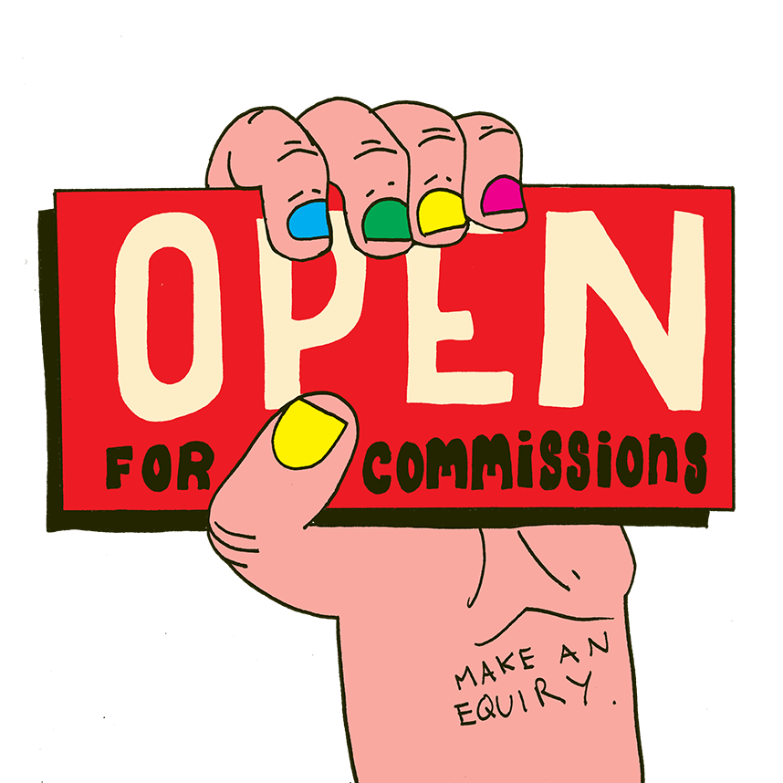
On that note, any support would me most welcome. Subscribe if you enjoyed this, share if you want, buy a print or commission an original illustration by a human.




I so much enjoy your work, honestly, I really do! As you write I could feel immense into it. I felt really connected with every words as it strike a cord in my heart.
My heart and mind was so absorbed as I read through your writing. There is no doubt that in years to come your work as an illustrator will make waves.
Thank you for sharing yourself with the world. You inspire me each day to drop all these ambitions of pursuing money these modern world has sold to us, and instead choose a life where I can wake up and work on things that truely matter.
Keep doing what you doing!
Much love from Nigeria ❤
Love to see the process!